Color Psychology and Typography for Custom Banners shape how fast a viewer understands and trusts what you promote. By blending color psychology with typography for banners, this approach communicates purpose at a glance and prompts action. This integration supports custom banners design guidelines, showing which color choices and font pairings maximize readability and impact. Following banner design best practices, designers balance contrast, scale, and hierarchy to guide the eye and boost response. Smart use of color palettes for branding and precise typography translates into clearer messages and higher engagement.
Viewed through another lens, the topic becomes how color mood and typeface choices drive banner visuals and brand storytelling. Hues convey emotion while letterforms organize information, shaping trust and prompting action in ads. This visual language relies on a balance of color and typography across formats to meet campaign goals. Practically, designers apply thoughtful palettes, legible type scales, and consistent typographic systems to ensure messages read clearly from a distance.
Color Psychology in Banner Design: Mood, Trust, and Action
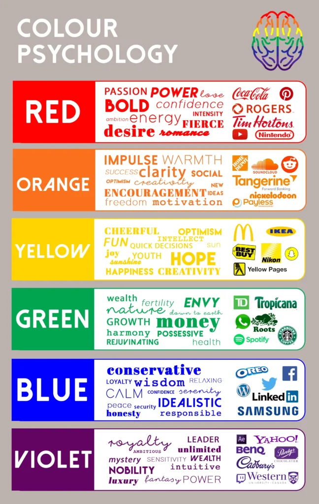
Color psychology shapes how viewers feel and act in response to a banner. Colors influence mood, urgency, trust, and perceived credibility, so choosing hues that reflect the campaign goal and brand voice is essential. For example, red can signal urgency and energy, blue can convey reliability, and yellow can evoke optimism. By aligning color choices with the desired response, banners become more than visuals; they become catalysts for action.
To apply color psychology effectively, map each color to the campaign objective. Use a dominant hue to carry the core message, a supporting color to provide depth, and an accent color to highlight the call to action. This approach also aligns with color palettes for branding, ensuring that banners harmonize with other marketing materials while standing out within a row of ads or on a webpage.
Typography for Banners: Readability, Hierarchy, and Impact
Typography is the vehicle that carries the message. For banners, legibility at a glance is non negotiable, so prioritize clear typefaces and scalable sizes. Sans serif fonts like Helvetica or Arial offer clean, screen-friendly letterforms, while serif fonts can convey tradition when used judiciously. The choice of font affects readability, mood, and perceived professionalism, making font selection a critical step in banner design.
Key typography tips for banners include establishing a clear typographic hierarchy with a dominant headline, a concise subhead, and a strong call to action. Pair a bold display font for headlines with a simpler body font, and limit the palette to two or three typefaces to avoid clutter. Consider viewing distance and medium, as banners seen from afar benefit from bolder letterforms and higher line height, while closer banners can accommodate tighter tracking for dense information blocks.
Color Palettes for Branding: Balance, Contrast, and Accessibility
A banner color palette should reflect brand identity while maximizing readability. Implement a structured trio: a dominant color to establish mood, a supporting color to organize information, and an accent color to draw attention to the CTA or key details. Achieving sufficient contrast is vital, especially for body text, and we often refer to color palettes for branding to maintain consistency across channels.
Beyond contrast, consider color temperature and saturation to guide the viewer’s eye without overwhelming the design. Neutral bases paired with vibrant accents can direct attention to the most important elements, while being mindful of readability on mobile and print. This approach supports cohesive branding and makes it easier to apply color psychology principles across multiple banners.
Color Psychology and Typography for Custom Banners
Color Psychology and Typography for Custom Banners work together to shape perception and drive action. By pairing mood-appropriate hues with readable, purpose-driven type, you reinforce brand personality while ensuring the message lands clearly. This is a core principle in custom banners design, where every color and letter matters for impact.
Apply a practical workflow that maps mood to goals, selects typography with intent, and aligns with the brand persona. Use color palettes for branding that support the campaign’s objective, and choose typefaces that are legible at the intended viewing distance. When executed together, color psychology and typography create banners that feel deliberate, credible, and action-oriented across channels.
Banner Design Best Practices: Layout, Accessibility, and Consistency
Banner design best practices emphasize a strong visual hierarchy, clear layout, and accessible color use. A well-structured layout guides the viewer from the headline to the supporting text and finally to the call to action, with contrast ensuring readability in bright environments and on mobile devices. Accessibility should be baked into the design, not added as an afterthought, including readable fonts, appropriate sizes, and non-color signals for actions.
Consistency across banners reinforces brand recognition. Use the same type system and color framework across campaigns while allowing context-specific variations. Regular testing in context—on actual devices and print—helps validate legibility, color balance, and impact, supporting ongoing iteration that keeps banners aligned with banner design best practices.
Frequently Asked Questions
What is the role of color psychology in Color Psychology and Typography for Custom Banners and how should it guide banner design best practices?
Color psychology guides mood, urgency, and trust in Color Psychology and Typography for Custom Banners. Start with a dominant brand color that matches the campaign goal, add a supporting color for structure, and an accent color to highlight the call to action, while ensuring high text contrast for readability. Apply banner design best practices by maintaining visual harmony and a clear typographic hierarchy that drives action.
How does typography for banners influence readability and mood within Color Psychology and Typography for Custom Banners?
Typography for banners shapes readability at a glance and conveys mood. Use a strong display font for headlines paired with a simple sans serif for body text, limit to two or three typefaces, and size for the intended viewing distance. Pair typography with color psychology to reinforce message intent—bold with urgent hues or calm with trusted tones.
What color palettes for branding work best for custom banners design when applying color psychology and typography for banners?
Choose a three-part palette: a dominant color that sets the mood, a supporting color for structure, and an accent color to highlight actions. Select hues that reflect brand values and campaign goals, ensure accessible contrast, and keep typography legible by using two to three fonts for consistency across banner designs.
What are banner design best practices for contrast and accessibility in Color Psychology and Typography for Custom Banners?
Follow WCAG contrast guidelines (4.5:1 for body text, 3:1 for large text) and test readability in context. Avoid signaling actions with color alone; include text within buttons or use icons to aid comprehension. Choose legible fonts, appropriate sizes, and sufficient spacing to maintain accessibility across devices and print materials.
How can layout, hierarchy, and consistency be applied in banner design to align color psychology and typography for banners with branding?
Establish a clear typographic hierarchy (dominant headline, supporting line, CTA) and use color to guide attention from headline to the call to action. Reuse the same typefaces and color system across campaigns to ensure branding consistency, while allowing subtle variations for context, offer, or audience. Design for different viewing distances by adjusting scale, weight, and line height to maintain impact.
| Aspect | Key Points |
|---|---|
| Introduction | Banners convey concise, action-oriented messages through color and typography; must communicate purpose at a glance in fast-moving marketing environments. |
| Understanding Color Psychology in Banner Design | Colors influence mood and behavior; red = urgency, blue = trust, yellow = optimism, green = growth; map color mood to campaign goal; ensure color harmony; define dominant, supporting, and accent colors; ensure contrast. |
| Typography Essentials for Banners | Typography carries the message; prioritize readability; sans-serif fonts for screens; pair fonts with clear hierarchy; limit to 2–3 typefaces; adjust size and tracking for viewing distance. |
| Color Palettes and Contrast for Readability | Palette reflects brand and context; ensure strong contrast per WCAG (4.5:1 body, 3:1 large); define dominant, supporting, and accent colors; consider color temperature and saturation. |
| Layout, Hierarchy, and Consistency | Establish visual hierarchy with size, weight, spacing, and alignment; color supports hierarchy; maintain consistency across banners with reusable type and color systems while allowing contextual variation. |
| Practical Design Workflow for Custom Banners | 7-step process: define goal and audience; establish color palette; choose typography; draft concise message; create visual hierarchy; test in context; iterate. |
| Practical Examples and Case Insights | Retail banners: warm colors with bold display typography create urgency; corporate banners: cooler palettes with stable type convey professionalism; health banners: greens with friendly rounded type convey vitality. |
| Accessibility and Inclusivity in Banner Design | Ensure legibility for visual impairments; avoid color-only signals for actions; include text in buttons or icons; test with real users; ensure high contrast. |
Summary
Color Psychology and Typography for Custom Banners is a powerful combination for creating banners that are not only eye-catching but also credible and effective. By aligning color mood with the campaign goal, selecting readable typography, and maintaining a consistent yet flexible design system, you can build banners that perform across channels and formats. Remember to test, iterate, and adapt the color palette and type strategy to the audience and context. With a thoughtful approach to color and type, your banners will stand out not just for their beauty but for their clarity and impact.