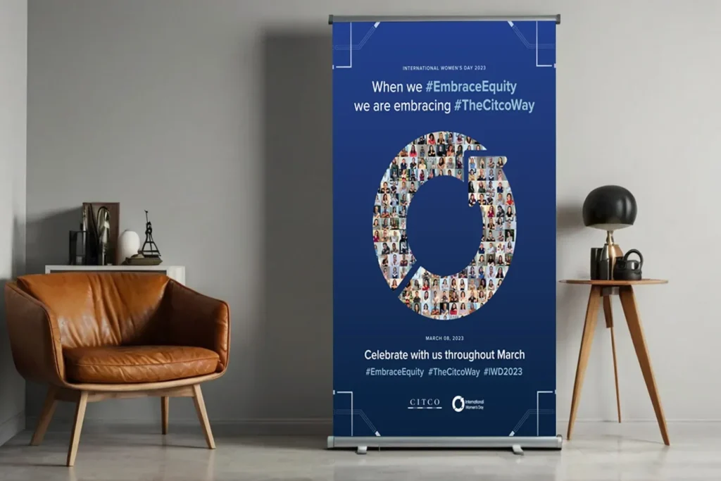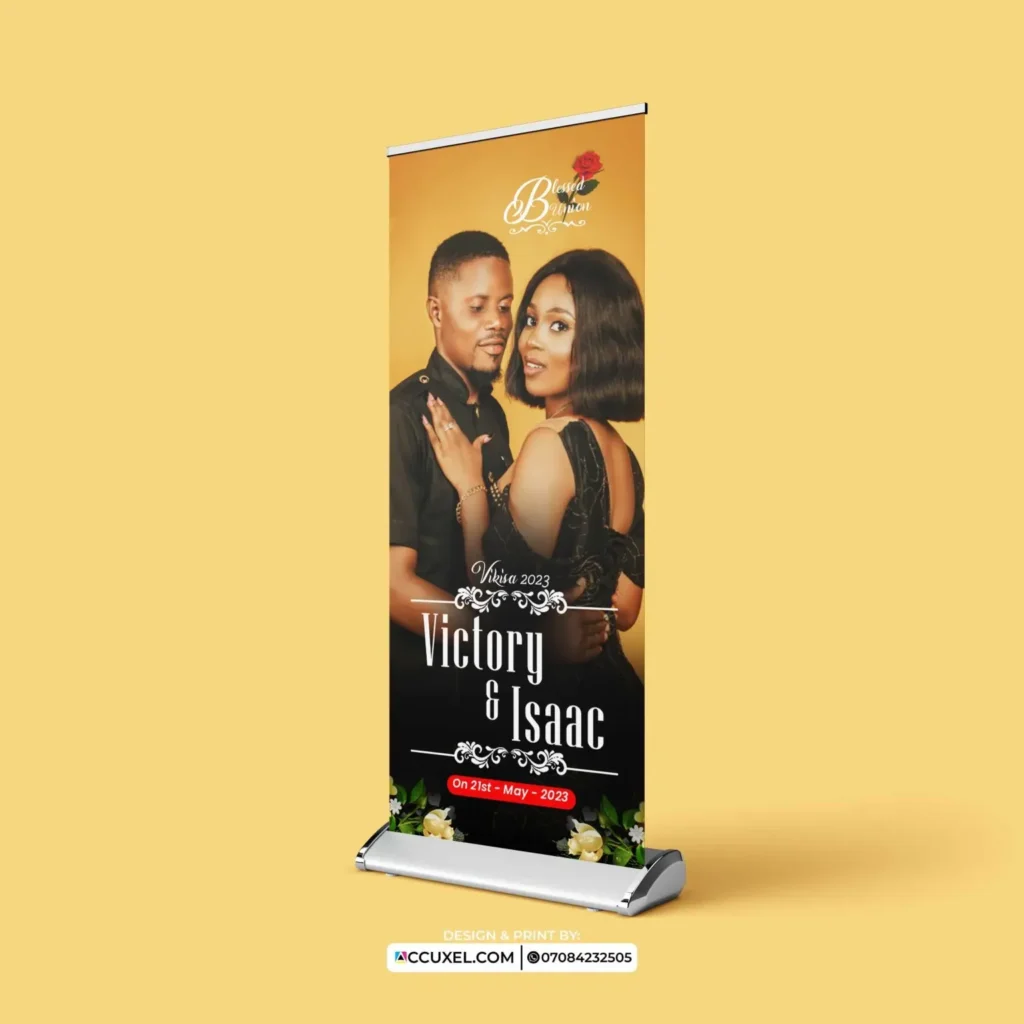
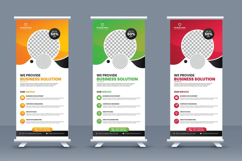
Custom Roll-Up Layouts command attention from the moment they appear, turning a simple banner into a narrative canvas that helps brands introduce themselves, highlight benefits, and invite action in crowded trade shows, conferences, or corporate events. A well-balanced composition pairs strong visuals with concise wording, enabling creative banner layouts to guide viewers through a natural path from hook to value, even at a quick glance. By prioritizing hierarchy, whitespace, typography, and color contrast, you ensure your message lands clearly and quickly, which matters when booth traffic is high and attention spans are short. This guide also translates design into practice by addressing print-ready roll-up layouts, durable materials, and practical considerations such as bleed, margins, and resolution, so your banner looks sharp whether displayed solo or alongside other media. With these principles, you can craft banners that feel cohesive, professional, and ready for real-world environments, helping your brand story resonate and convert curiosity into engagement.
Beyond the term roll-up banners, marketers can think in terms of portable display stands and pull-up banners that still carry a clear narrative and strong visuals. Effective signage uses layout strategies that prioritize legibility, hierarchy, and emphasis, ensuring messages land quickly in crowded venues. By exploring variations in size, format, and materials, designers can adapt the same design principles to different environments—from trade floors to lobby walls—without sacrificing branding. The underlying idea is to optimize the composition for quick scans, consistent branding, and durable production, so teams can deploy persuasive signage with confidence.
Understanding Custom Roll-Up Layouts: The Core of Effective Banner Design
Custom Roll-Up Layouts transform a simple banner into a storytelling device that quickly communicates value and prompts action. By organizing visuals, headlines, and logos into a coherent flow, these layouts guide a viewer from first glance to engaged reading, even in noisy environments such as trade shows or corporate events.
Beyond aesthetics, layout decisions influence how easily people scan, remember, and respond. Strong alignment, balanced negative space, and a clear typographic hierarchy create a memorable impression. When designed as print-ready roll-up layouts, the file is prepared for high-quality output without surprises at the printer, and the concept is reinforced by consistent use of visual cues across assets like custom roll-up banners.
Balancing Text and Imagery for Maximum Impact
Effective balance starts with a clear hierarchy: a bold, scannable headline, a supportive subhead, and concise body text. This approach aligns with banner design tips that prioritize readability from a distance while conveying the core message in seconds.
To maximize impact with roll-ups, reserve space for a striking visual that supports the headline, not competes with it. Keep paragraphs short, use bullet points where appropriate, and ensure every element has a purpose that ties back to the main offer; this also helps when preparing print-ready roll-up layouts for different vendors or placements.
Creative Banner Layouts: Patterns that Capture Attention
Creative banner layouts explore patterns such as grid-based arrangements, focal-point hero shots, and motion-inspired diagonals. By describing a predictable path across the design, you help viewers quickly locate the key message and benefits—an essential principle of creative banner layouts.
Use patterns consistently across campaigns to maintain brand coherence. Adapt the same structural logic to different content lengths and formats, ensuring the layout still reads clearly when scaled for social or print; this flexibility is central to effective roll-up design.
Design Tips for Trade Shows and POP Displays
Trade shows and POP displays demand visibility from several meters away and in varied lighting. This makes contrast, typography, and image choice critical. Follow banner design tips that emphasize a bold headline, legible typefaces, and a color punch that stands out in crowded environments.
Include a single, actionable CTA and keep supporting copy to a minimum. When the layout supports the user journey—from glance to read to action—it’s easier to convert interest into engagement. If needed, test different versions and ensure the final files align with print-ready roll-up layouts before production.
Typography and Color: Crafting Readable, Appealing Roll-Ups
Typography choices shape readability at typical trade-show distances. Favor clean sans-serifs, appropriate line length, and ample line spacing to avoid crowding the eye, while color choices reinforce hierarchy and mood. The right typography is part of the banner design tips that make complex information feel approachable.
Color theory matters for contrast, accessibility, and brand identity. Use a limited palette with sufficient contrast ratios and consistent usage of brand hues across assets. When you design with care, your roll-up communicates authority even before someone reads the copy.
Practical Print Considerations: From File Prep to Roll-Up Assembly
From the geometry of the stand to the bleed, DPI, and safe margins, print-ready specifications shape what the audience sees. Prepare artwork at the correct resolution and with appropriate color profiles to ensure sharp, vibrant output on roll-up banners.
Proofs, vendor guidelines, and file naming conventions help you avoid last-minute surprises. Plan for trim, fold lines, and mounting hardware, and keep the final deliverable aligned with print-ready roll-up layouts so production runs smoothly and color remains consistent.
Frequently Asked Questions
How can Custom Roll-Up Layouts maximize impact with roll-ups at trade shows and events?
Shape the layout with a clear hero message placed high and center, supported by a single strong image. Establish visual hierarchy using typography, color, and whitespace so viewers grasp the value quickly. When designing, consider print-ready roll-up layouts from the start: correct dimensions, bleed, color profiles, and scalable assets to ensure professional results.
What are effective banner design tips for Custom Roll-Up Layouts to improve readability?
Limit to two or three fonts, use large, legible type, and set high contrast between text and background. Place key benefits near the top and support with a clean visual. Draft with print-ready roll-up layouts in mind to ensure crisp rendering and color accuracy.
How can Creative Banner Layouts balance text and imagery in Custom Roll-Up Layouts?
Use a grid to align elements and create a clear reading path. Let imagery support the headline rather than compete with it; keep copy concise and scannable. Test at typical viewing distances, and export as print-ready roll-up layouts to preserve sharp edges.
What common mistakes should you avoid in print-ready roll-up layouts for Custom Roll-Up Layouts?
Too much text, cluttered visuals, tiny fonts, inconsistent branding, and neglecting bleed or trim guides. Avoid low-resolution logos, and ensure safe margins and color accuracy by using print-ready file formats.
What steps create a practical framework for designing Custom Roll-Up Layouts that perform at events?
Define the objective and audience, draft a simple message, choose a bold visual, and establish a grid. Create mockups and gather feedback, then finalize with vector logos and print-ready specifications. Verify file delivery details (dimensions, bleed, color profile) to ensure production goes smoothly.
How can you maximize impact with roll-ups by applying banner design tips in Creative Banner Layouts for events?
Focus on a dominant visual, minimal copy, and a strong call to action. Use a consistent color palette aligned with branding, and ensure alignment with the grid and margins. Prepare assets in print-ready roll-up layouts with the correct resolution and file formats.
| Key Point | Description |
|---|---|
| Purpose and role | More than a pretty banner; acts as a storytelling device to attract attention and convey value. |
| Attention and value | Designed to grab attention and communicate value quickly. |
| Drive action | Positions messaging to prompt viewers to take action in seconds. |
| Contexts | Effective in trade shows, POP displays, corporate events. |
| Design formula | Combine strong visuals, clear typography, and concise messaging. |
| Print considerations | Account for practical print factors such as resolution, color, bleed, and durability. |
| Layout decisions | Layout choices matter; how you arrange elements affects whether people stop, read, and engage. |
| Framework | Provides a practical framework for banners that look professional and perform in real-world settings. |
Summary
Conclusion: Custom Roll-Up Layouts set the stage for effective banner design, blending storytelling, compelling visuals, typographic clarity, and concise messaging to maximize impact. This approach emphasizes thoughtful layout decisions, balancing text and imagery, and considering print-ready details to create banners that captivate audiences at events and drive tangible results. By following the practical framework outlined, designers can produce banners that not only look professional but also perform well in real-world settings, delivering measurable outcomes for trade shows, POP displays, and corporate events.