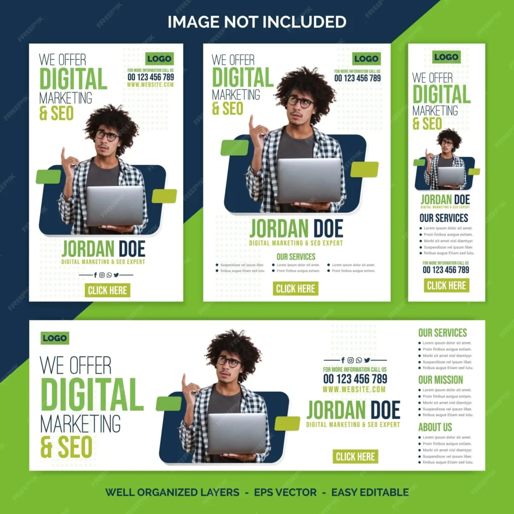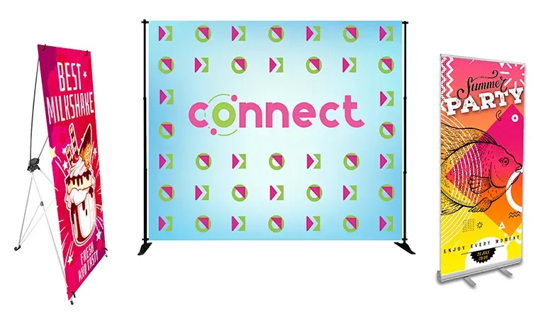

Custom banner design mistakes can quietly sap CTR and inflate ad spend, even when visuals look polished. To improve outcomes, you should follow banner design best practices that emphasize clarity, audience relevance, and concise messaging. Avoid common banner design errors by prioritizing legibility, consistent branding, and correct sizing across placements. This guide offers effective banner design tips and practical fixes you can apply to display banners, social ads, and email creative. When done well, digital advertising banner design aligns with your message, landing pages, and user expectations to drive meaningful action.
Seen through an alternative lens, the topic can be reframed as banner creation pitfalls, display ad flaws, or layout missteps, rather than a single failure at the screen. Embracing related terms such as how to design banners, banner optimization, and ad asset quality helps teams map connections between concepts and identify where improvements will move the needle. This approach aligns with Latent Semantic Indexing principles, which favor semantically related terms—such as branding consistency, accessibility, and visual hierarchy—to guide content and design decisions across channels.
Clear Messaging and Value Proposition: The Core of Effective Banner Design
In banner design, messages must be concise and compelling. A banner acts as a fast invitation to learn more, so the value proposition should be crystal clear within a fraction of a second. Following banner design best practices helps ensure the core benefit is front and center, and it aligns with how to design banners across channels. This approach also supports effective digital advertising banner design by emphasizing a single, standout claim.
Keep copy tight: a bold headline of 3–7 words and a supporting subhead of 8–12 words. Pair this with a CTA that matches the landing page. By focusing on the customer benefit rather than features, you reduce friction and improve CTR. This is a reliable foundation noted in effective banner design tips and common banner design errors to avoid.
Readability and Accessibility Across Devices
Typography and contrast matter for readability, especially on mobile and in bright light. Use 1–2 font families, bold for headlines, lighter for body, and ensure a minimum contrast ratio of 4.5:1 per WCAG. Addressing accessibility early helps reduce drop-off and expands reach, which is a key element in banner design best practices.
Test readability across devices and lighting conditions; don’t rely on color alone to convey meaning. Use clear labels and consider accessible design practices as part of how to design banners; this aligns with banner design best practices and effective banner design tips. By validating readability in real-world contexts, you avoid common banner design errors and improve universal comprehension.
Visual Clarity, Color Harmony, and Brand Consistency
A clutter-free layout helps the message cut through. Limit the color palette to 2–4 colors aligned with your brand, apply the rule of thirds, and maintain generous white space around the main message. This disciplined approach reflects banner design best practices and supports a clean, scannable experience across channels.
Choose a single high-impact image or vector element that reinforces the message, and include a brand element without overpowering the copy. This focus keeps the visual system cohesive within digital advertising banner design, ensuring consistency across platforms and reinforcing brand recognition.
Custom Banner Design Mistakes and How to Avoid Them
Custom banner design mistakes can derail campaigns before they start. The term itself points to missteps like vague messaging, inconsistent branding, or mis-sized assets. Recognize this pattern and address it with a structured approach drawn from banner design best practices to move beyond guesswork.
Fixes include defining a single value proposition, maintaining a brand kit, and building templates for platform-specific sizes. Start with the goal, map copy to that goal, and test variations using effective banner design tips. This aligns with how to design banners and digital advertising banner design, ensuring scalable, on-brand assets across channels.
Platform-Responsive Sizing, Testing, and Optimization
Platform-specific sizing matters: start with the platform’s recommended sizes and aspect ratios, and design modular components that scale. Build safe zones so critical text remains visible in different placements, and test across placements before finalizing assets. This disciplined setup mirrors common banner design errors to avoid by planning for multiple contexts.
Use A/B testing to optimize headlines, images, and CTAs across desktop, mobile, and email. Track performance and iterate, ensuring the landing page experience matches the banner promise—this is a core part of banner design best practices and digital advertising banner design. By embracing iterative testing, you ensure banners stay effective as formats and audiences evolve.
Frequently Asked Questions
What are the most common Custom banner design mistakes and how do they relate to banner design best practices?
Common Custom banner design mistakes include vague messaging, poor typography with low contrast, cluttered layouts, and inconsistent branding. Following banner design best practices means defining a bold value proposition, using legible typefaces, creating a clear visual hierarchy, and adhering to brand guidelines. Prioritizing clarity, accessibility, and platform-appropriate sizes improves engagement and conversions.
How can I fix typography and contrast issues that are typical custom banner design mistakes and align with effective banner design tips?
Fix typography by using 1–2 fonts, bold headlines, and readable subheads; ensure WCAG-compliant contrast (at least 4.5:1) and test readability on mobile. These steps reflect effective banner design tips and help eliminate custom banner design mistakes, boosting readability and accessibility.
Why do wrong banner sizes and platform mismatches create common banner design errors in digital advertising banner design, and how can you avoid them?
Begin with the platform’s recommended sizes and create modular designs that adapt to multiple placements; include safe zones to keep critical text from being cropped; test across placements before finalizing assets. This aligns with banner design best practices for digital advertising banner design and helps prevent common banner design errors and Custom banner design mistakes.
How does image quality impact digital advertising banner design, and how can low-resolution assets lead to custom banner design mistakes?
Use high-resolution assets (ideally 150–300 PPI for rasters) or scalable vector graphics; prefer crisp vector icons and consistent branding across banners. Low-quality imagery erodes credibility and engagement, contradicts banner design best practices, and contributes to Custom banner design mistakes.
What practical steps can I take to test and iterate banners to prevent Custom banner design mistakes when learning how to design banners?
Run quick A/B tests for headlines, images, and CTAs; test across devices and channels; use data-driven changes to guide iterations; establish a regular review cycle. This practice mirrors not-testing pitfalls and aligns with banner design best practices and digital advertising banner design to avoid Custom banner design mistakes.
| Key Point | What It Means | Why It Matters / Tips |
|---|---|---|
| Fast capture and action | Well-designed banners grab attention quickly and prompt meaningful action in a fast-paced digital environment. | Focus on clarity, hierarchy, and a single clear value proposition to improve engagement. |
| Not just aesthetics — impact on performance | Custom banner design mistakes are not only about visuals; they affect CTR, conversions, and ROI. | Identify common pitfalls early to avoid wasted ad spend; prioritize performance metrics. |
| Guidance from best practices | Understanding pitfalls and applying proven banner design best practices lifts banners from generic visuals to high-performing assets. | Use a structured, best-practice approach across campaigns. |
| Platform-spanning applicability | Fixes apply to both simple display banners and multi-channel campaigns. | Design with platform specifics and accessibility in mind. |
| Audience resonance and branding | Banners should resonate with the audience while keeping branding and accessibility in focus. | Balance messaging with brand consistency and inclusive design. |
| Desirable outcome: consistency and impact | Mastering these principles leads to banners that perform consistently. | Iterate with testing and performance data to sustain results. |
| What you’ll learn | The guide covers common errors and practical, actionable fixes. | Apply a structured approach to design aligned with your goals. |
Summary
Please see the HTML table above for a structured summary of the key points from the Introduction.